SideJobs
UI/UX · Illustration · Motion · Art direction
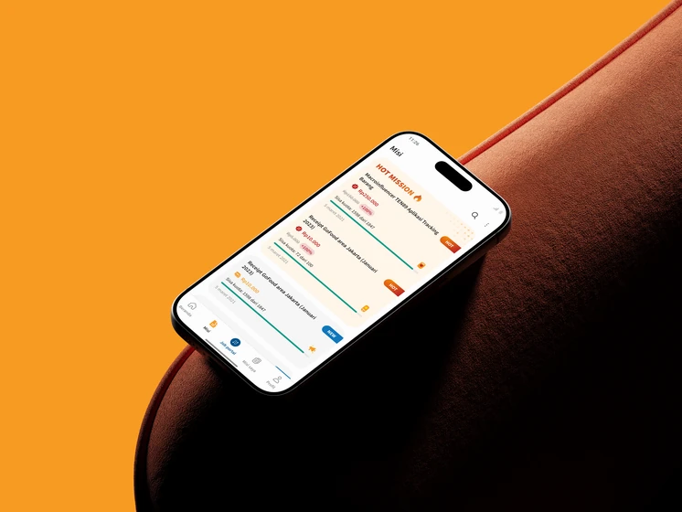
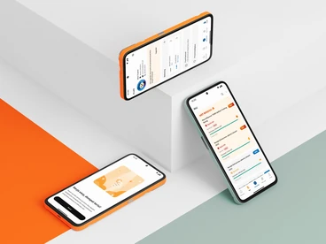
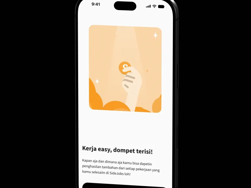
A full redesign of an app where users earn money by completing missions. I was the only designer on a team of five, and I built the Seeker design system, a custom icon set, and a mascot, all shared with NusaTalent (same app, via the Job portal tab). It never shipped: the app developer was laid off before implementation.
Nusatalent. 2022

Problem
The app dated from 2018, and my first impression was that it looked like a scam. It also had usability and accessibility issues.
Audit
The existing research was old, so I only used it for the target users (17 to 25, students and fresh grads). I ran a heuristic evaluation and logged 31 issues. The common ones were small touch targets, inconsistent spacing, and weak contrast.
Key decisions
- Seeker rules: 24dp radius, 44dp touch targets, 11sp minimum text, and black buttons instead of orange for contrast.
- Bigger login fields placed for thumb reach (Law of Proximity, Fitts’ Law).
- Withdraw and History sit in the balance card (Law of Common Region).
- “Hotsale” became “Hot”, since nothing was discounted.
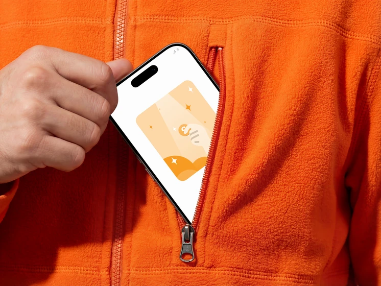
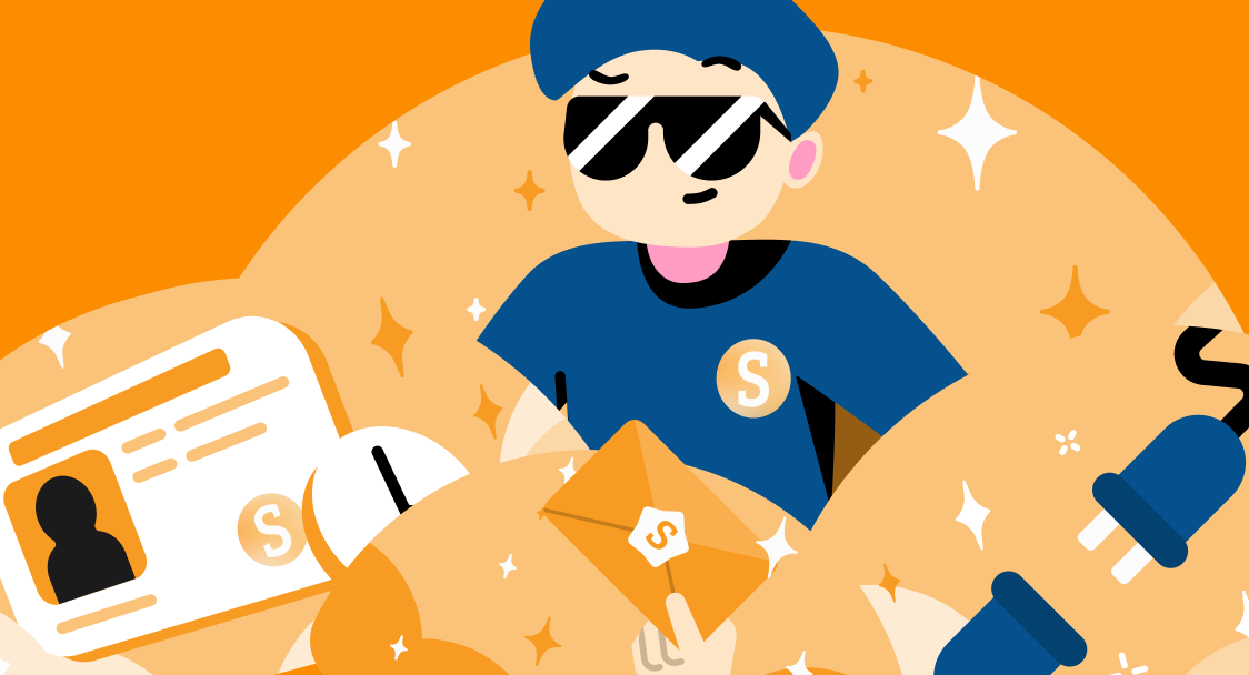
- About 75 icons drawn from scratch, plus Sanu, a shared mascot (an anagram of Nusa) whose illustrations always sit inside a half circle, flipped from Samsung’s version.

Result
It’s not shipped, so there’s no impact data. All 31 findings are addressed, and NusaTalent now has a system to keep its products consistent.
Credits
Arthur Bachtiar Gunawan
Rieky Lesmana
Adam Gabriel Mounir
Salman Alfarisi
Hendricksen Sutianto