Kilatpedia
UI/UX · Brand · Illustration · Motion · Art direction
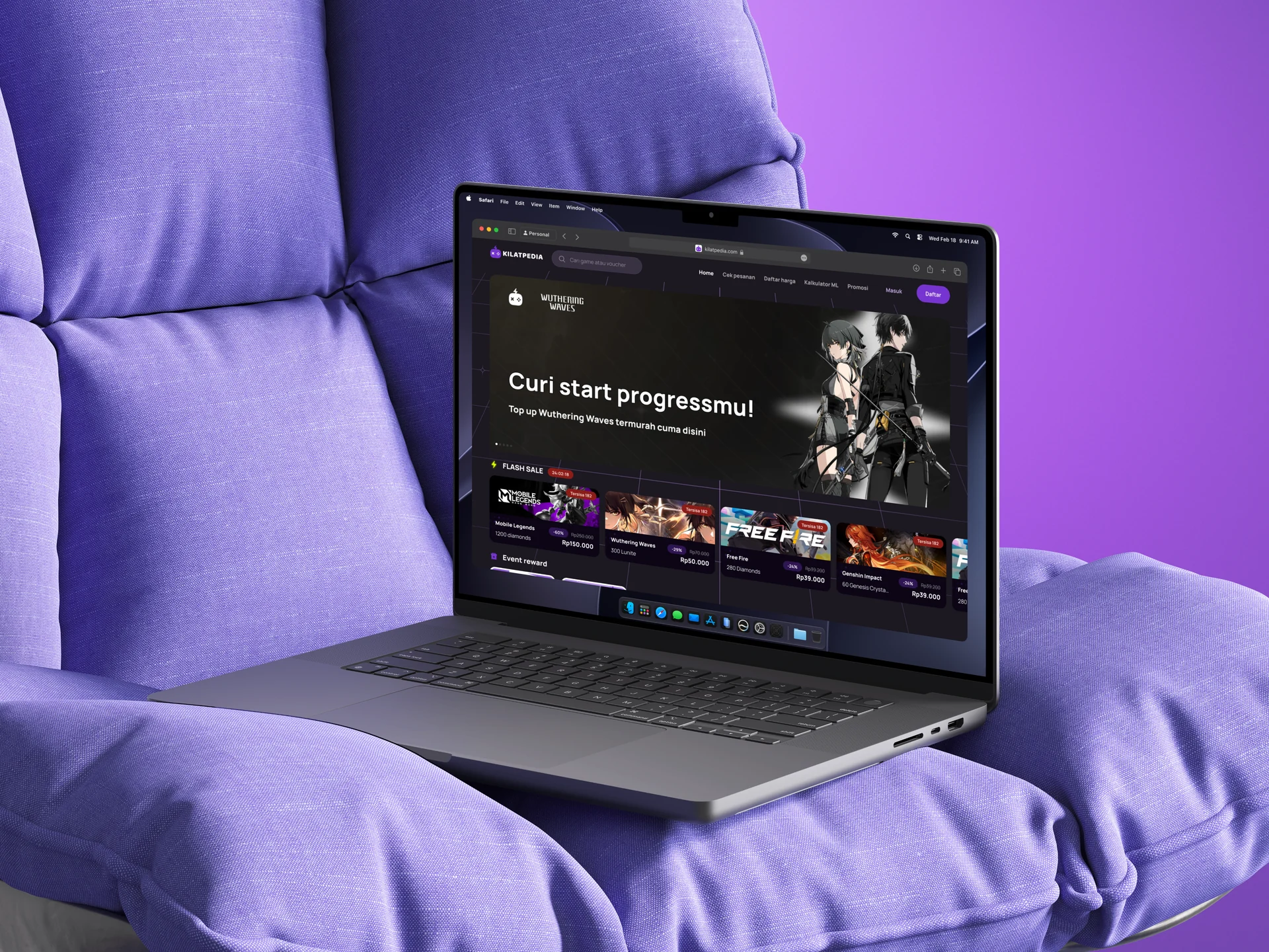
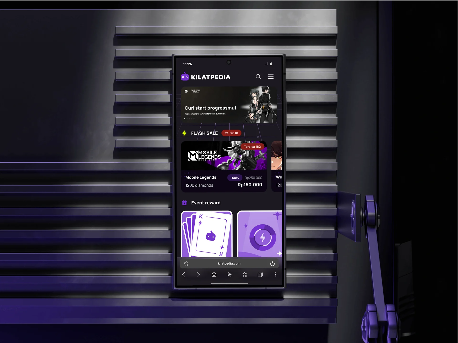
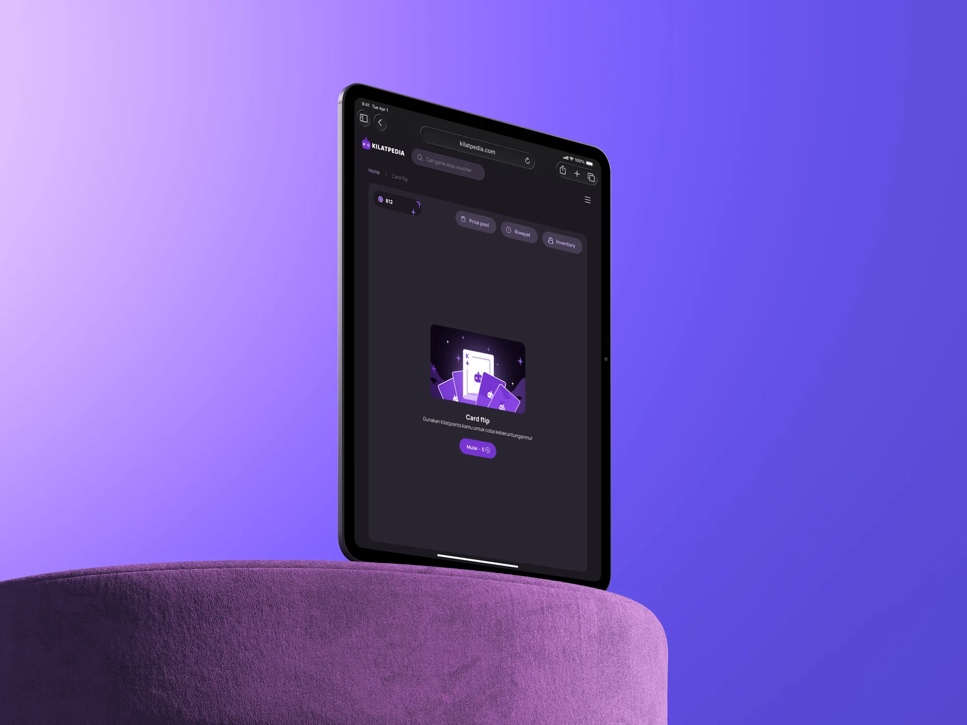
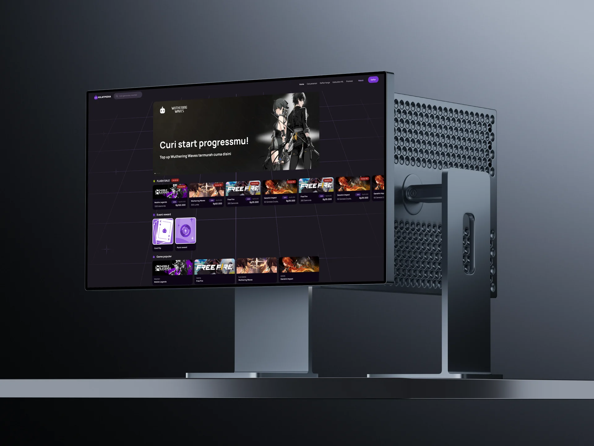
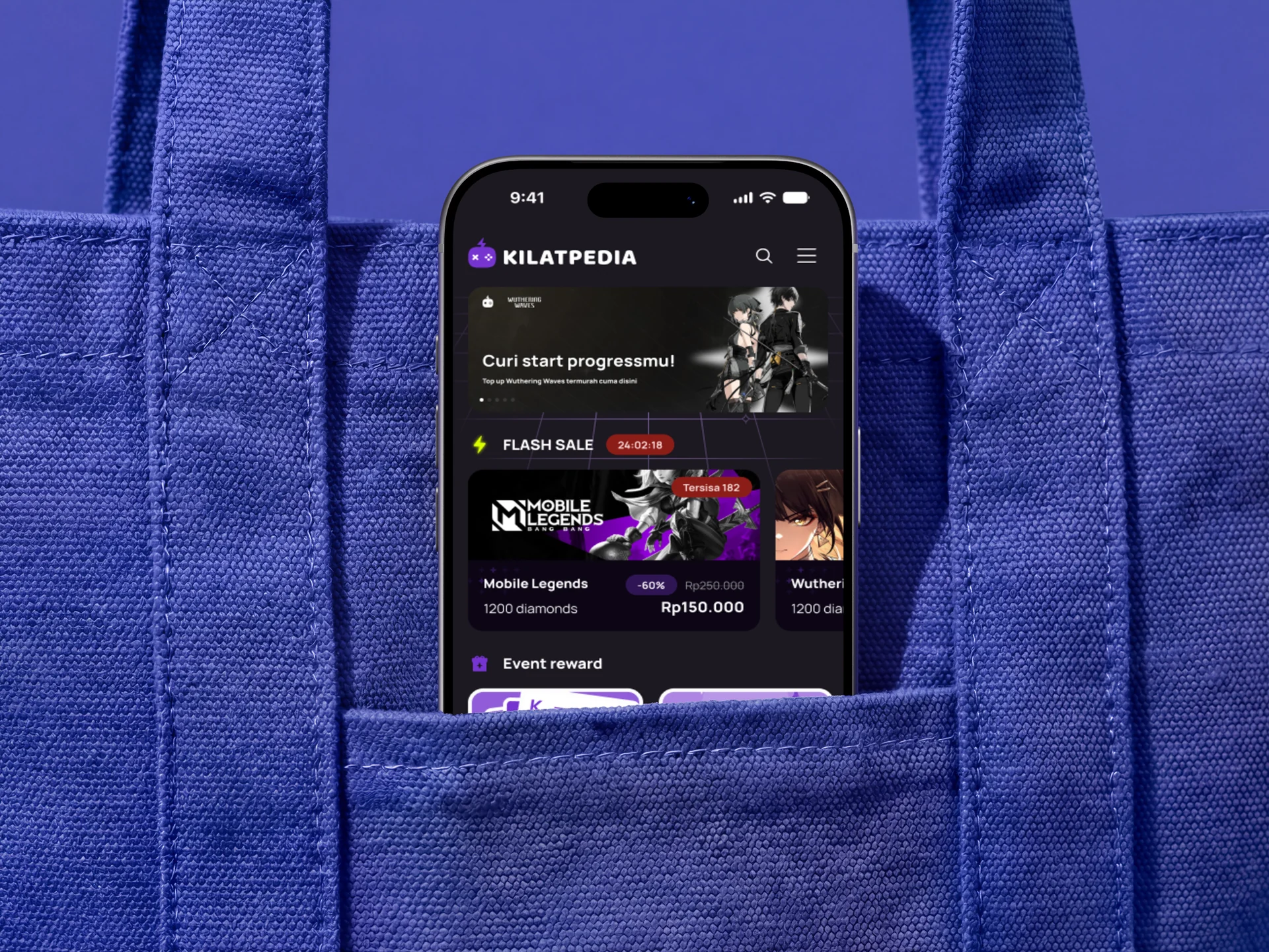
Kilatpedia was a top-up platform for in-game currency. I designed all of it: the logo, design system, illustrations, animations, and 14 pages across every Tailwind breakpoint. I handed the final files to the developer and delivered ahead of schedule.
Freelance. 2023
Brand
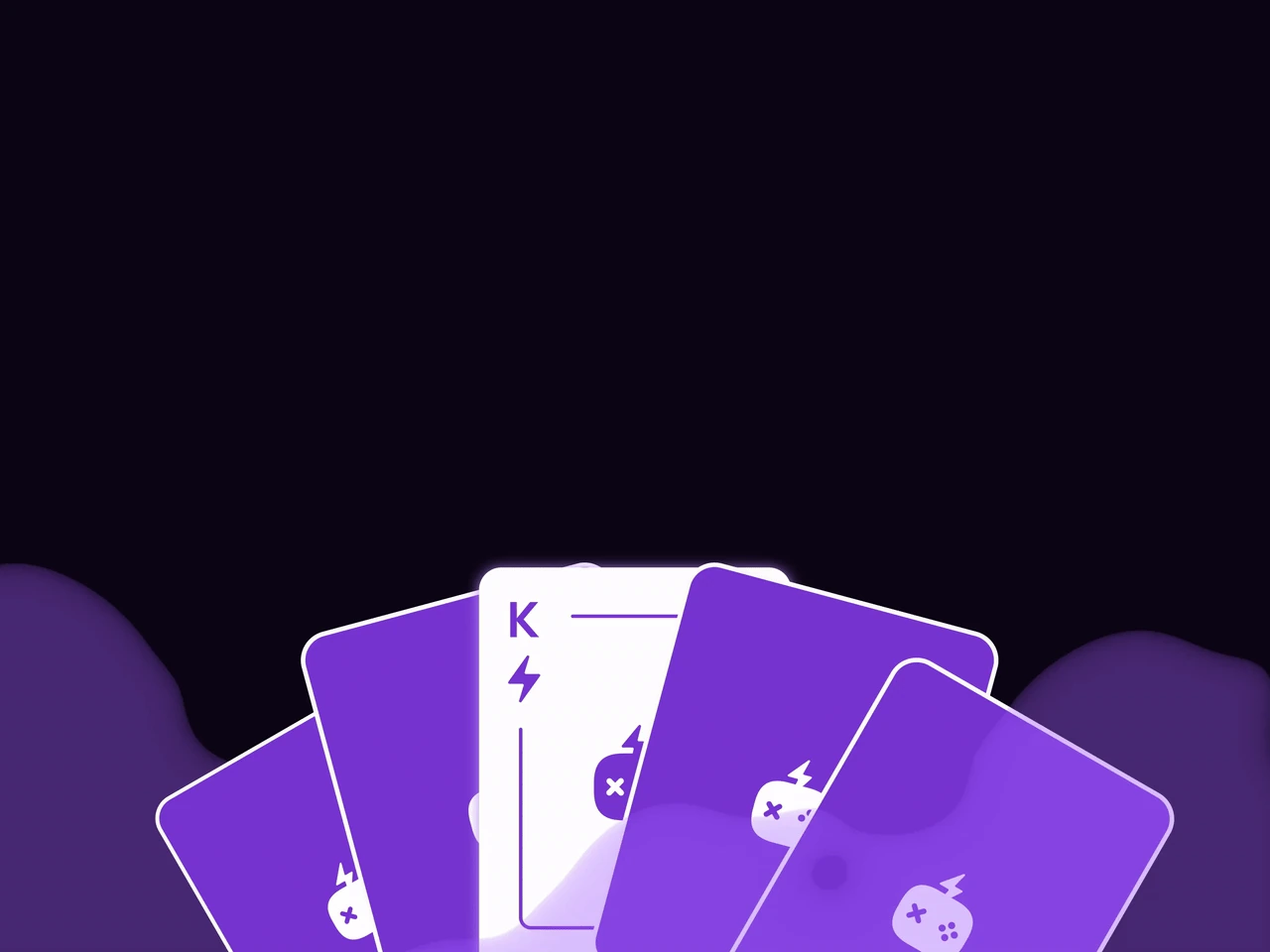
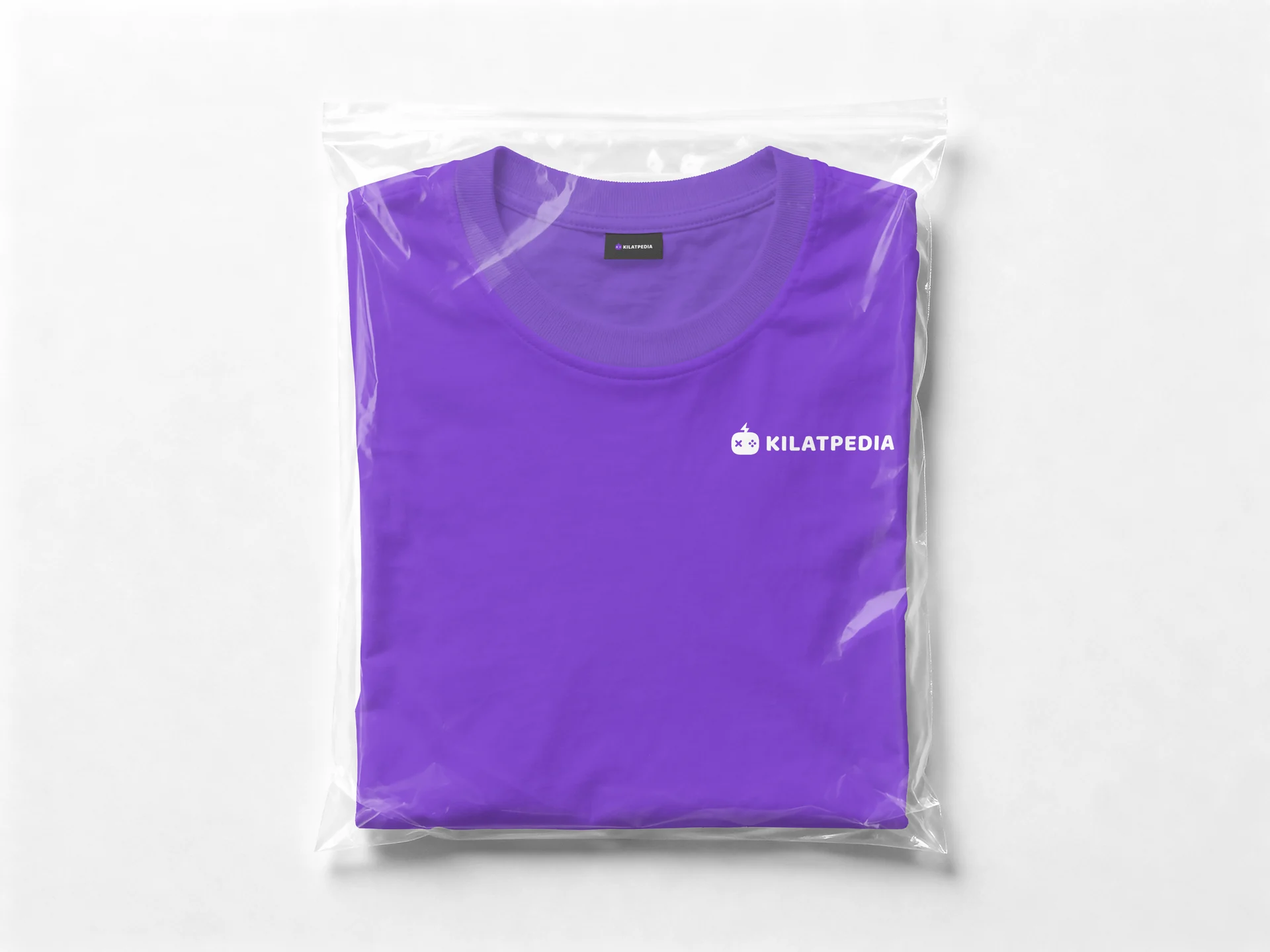
The old logo was poorly made, so I offered to redo it for free: a gamepad with a lightning bolt (“kilat” means lightning). Purple because gamers already link it to Twitch, Discord, and “epic” item rarity.

Design system
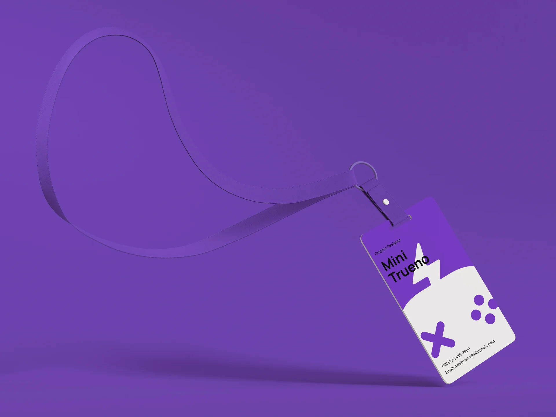
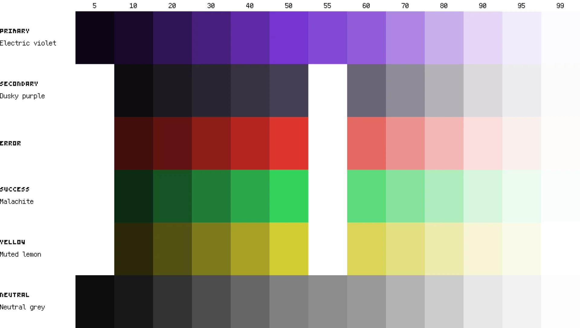
Tokens and variables, a palette blended from three color harmonies (only Triad had a proper Success shade), and Manrope on a 14px Minor Third scale.
- Electric violet
- #7634D0
- Dusky purple
- #463D52
- malachite
- #34D15A
- muted lemon
- #D1CC34
- Neutral grey
- #808080
Result
We tested with 2 participants across 3 tasks (purchase, Card Flip, point exchange). Both finished everything and found it intuitive. It’s a small test, but it confirmed the core flows.
Credits
Maevy Marvella
Wisely Nelson
Aradhana Indra Daniswara
Yofadha Berliano
Michael